Artist Spotlight, History Of Comics, NEW PRODUCT
Spawn: The Walking Dead Original Sketch Cover Artwork
By Joshua H. Stulman
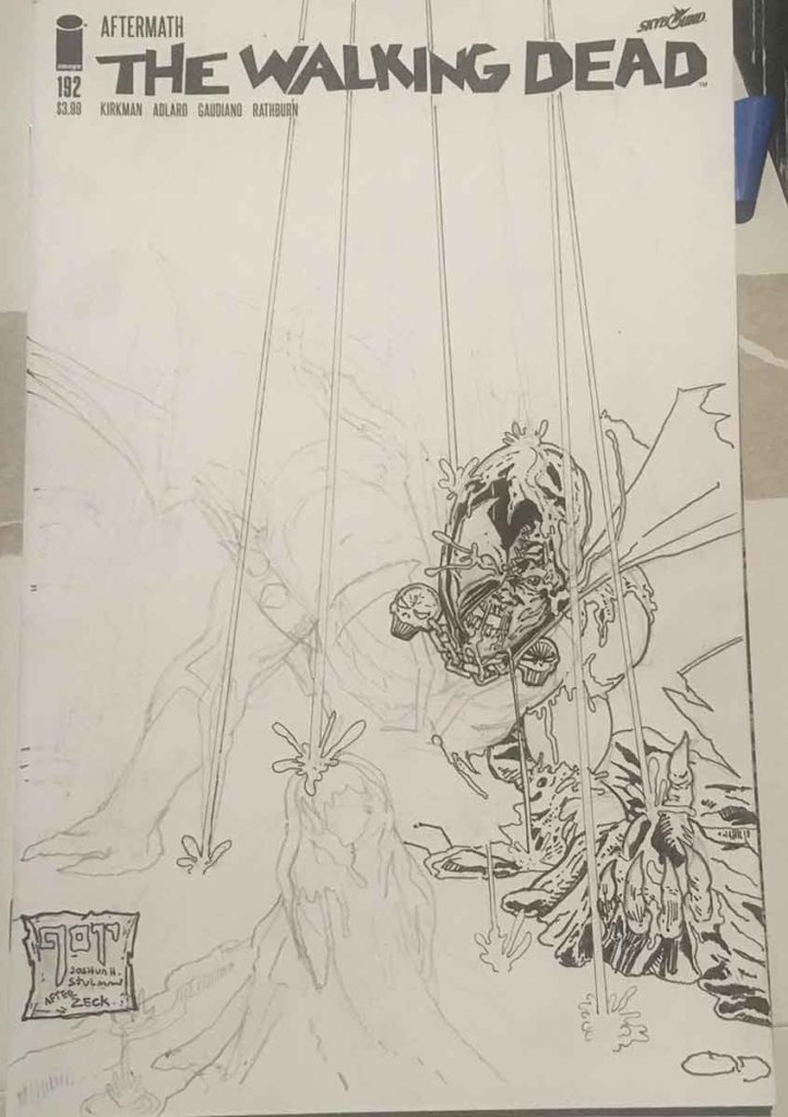
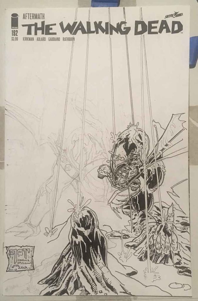
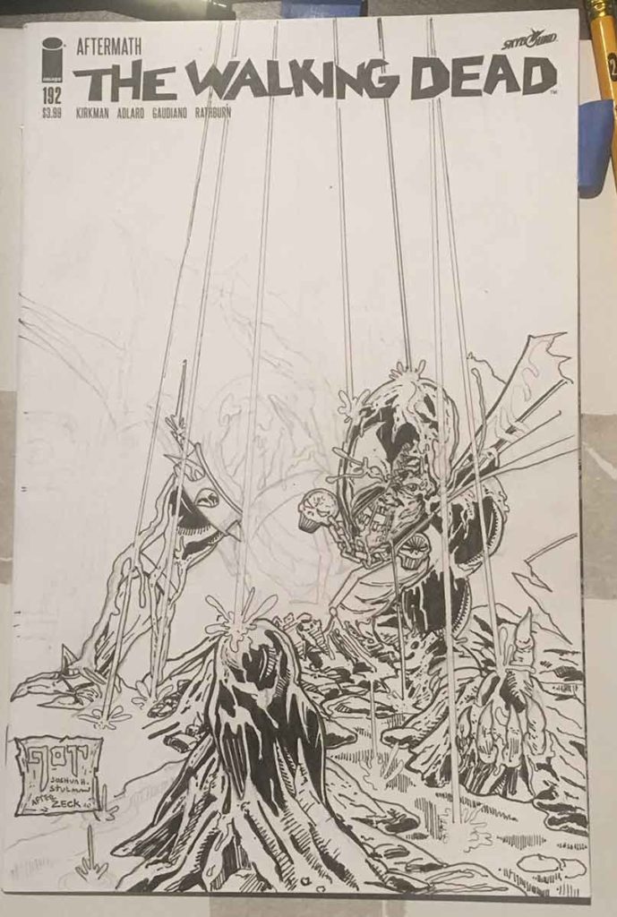
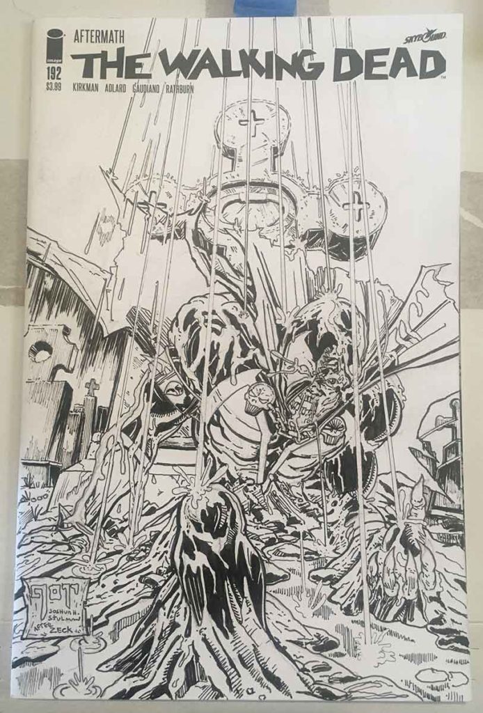
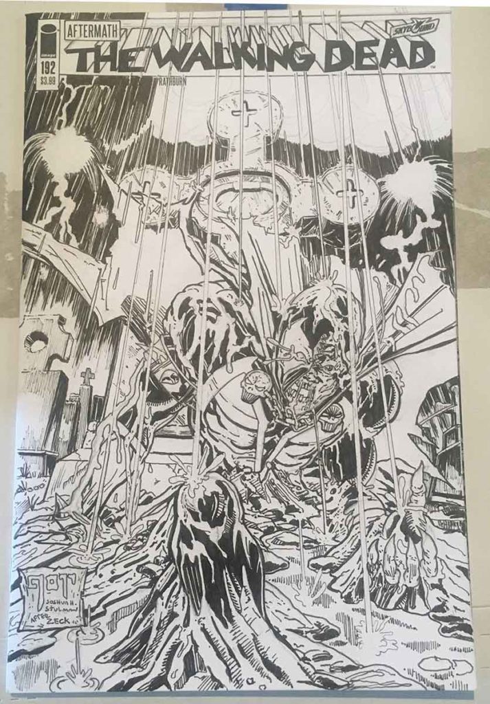
Spawn: The Walking Dead was a concept that was suggested to me by a fellow comic book store owner, during a discussion about Sketch Cover ideas for the Walking Dead blank variant cover. The suggestion was made that using a Walking Dead blank cover for a Spawn homage would be appropriate- after all isn’t Spawn a zombie?
Well, he certainly looks like a zombie when he’s unmasked, he’s definitely been dead and brought back to life and plus, he’s an Image character like the Walking Dead- and of course, I didn’t have a Spawn blank cover anyway.
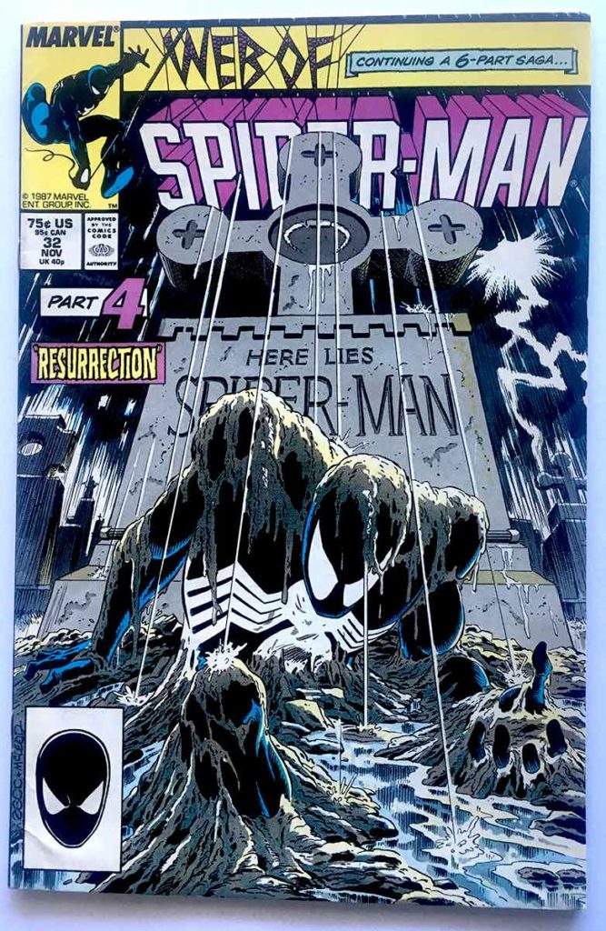
So as the wheels started turning in my mind about what to draw, I remembered Mike Zeck‘s cover to Web of Spider-Man # 32 during the “Kraven’s Last Hunt” storyline that showed an eerie scene of Spider-Man emerging from a grave after being buried alive. What a perfect concept for a Spawn homage!
At a first glance, Zeck’s artwork is a technical illustration – with streaks of rain streaming in a high point perspective from a darkened and cloudy sky. This meant that every vertical line in the entire illustration had to angle inward towards this point. So not just the rain streaks, but also the tombstones as well. To top it off, I also had to identify enough rain streaks to be outlined so that they would jump out when black ink was laid behind them. Too many streaks and the illustration looks gridded, too little streaks and the view becomes aware of the artist placement. It has to look organic and natural.
After studying, Zeck’s cover art, he only shows a few streaks that start at the top of the art and carry through all the way down the piece. The rest of the rain is alluded to by showing the pooling of water on the ground or the beading on the top of the central tombstone. The streaky line work on the stormy clouds also helps convey the idea of a rain-storm and needed to be done in consideration of the high point perspective.
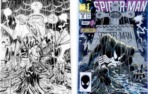
I knew areas of the original Zeck cover would be blocked out in the homage art due to the addition of Spawn‘s cape. I wanted the cape to have that sharp tattered feel that McFarlane draws, but without taking up either too much of the ground or tombstone (both important aspects of the piece). I was able to come up with a satisfied design that allows the cape to have some dynamic flow without taking up too much of the actual space of the cover. It also conveniently divides the sky in a way that makes it much easier to ink in sections.
Finally, the handling of the title text was of some concern because its colored black against what was going to be a black sky. When I placed the box around the Image logo and issue number, I realized the simplest thing to do would be to place the important type in boxes as well, surprisingly similar to how the original type was handled in Zeck’s cover. After I came to that decision, I realized that I also had to modify the text of “The Walking Dead” to mimic the perspective block affect of the original “Web Of Spider-Man” typeface.
I’m very satisfied with how this Spawn: The Walking Dead artwork turned out. I really enjoy it in black and white (just like the interior art to Walking Dead), although at some point I’ll probably release it as a digitally colored 11″ x 17″ print.
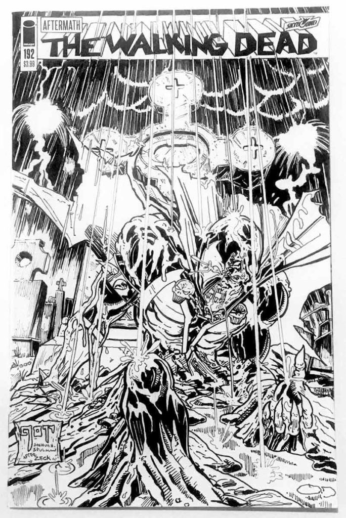
I am making this one-of-a-kind original artwork available for sale. I don’t do too many full illustration sketch covers due to the amount of time that they require. But this is certainly a great piece for any collector of The Walking Dead, Spider-Man or Spawn.
TO ORDER THIS ORIGINAL ARTWORK: CLICK HERE
To See Other Original Artwork by Joshua H. Stulman: CLICK HERE
Want to Commission an Original Artwork? Contact us at info@brooklyncomicshop.com




Leave a reply