Recently added item(s)
Cart Subtotal
$29.99Recently added item(s)
Cart Subtotal
$29.99Recently added item(s)
Cart Subtotal
$29.99by Joshua H. Stulman
Superman, the first ever super-hero, is a comic that helped define the genre and comic book industry at its inception. From the start in 1938, Superman was a progressive hero whose early adventures exposed government corruption, homelessness, dangerous work conditions, and munitions profiteering. When World War II had begun, Superman went to work fighting the Axis even before America was officially involved.
I was recently commissioned to design a sketch cover for Action Comics #1000 in the style of the Golden Age Superman covers. The request was clear in having Superman in his original costume as he takes on Hitler. In actuality, Superman has confronted Hitler on numerous covers from World’s Finest, Action Comics and Superman throughout the war years. What most people forget is that these are usually just the cover art, and not the interior story. However, Joe Shuster and Jerry Siegel were asked by Look Magazine to create a 2 page story about how Superman would end the war in 1940. (Below is a panel from that story).
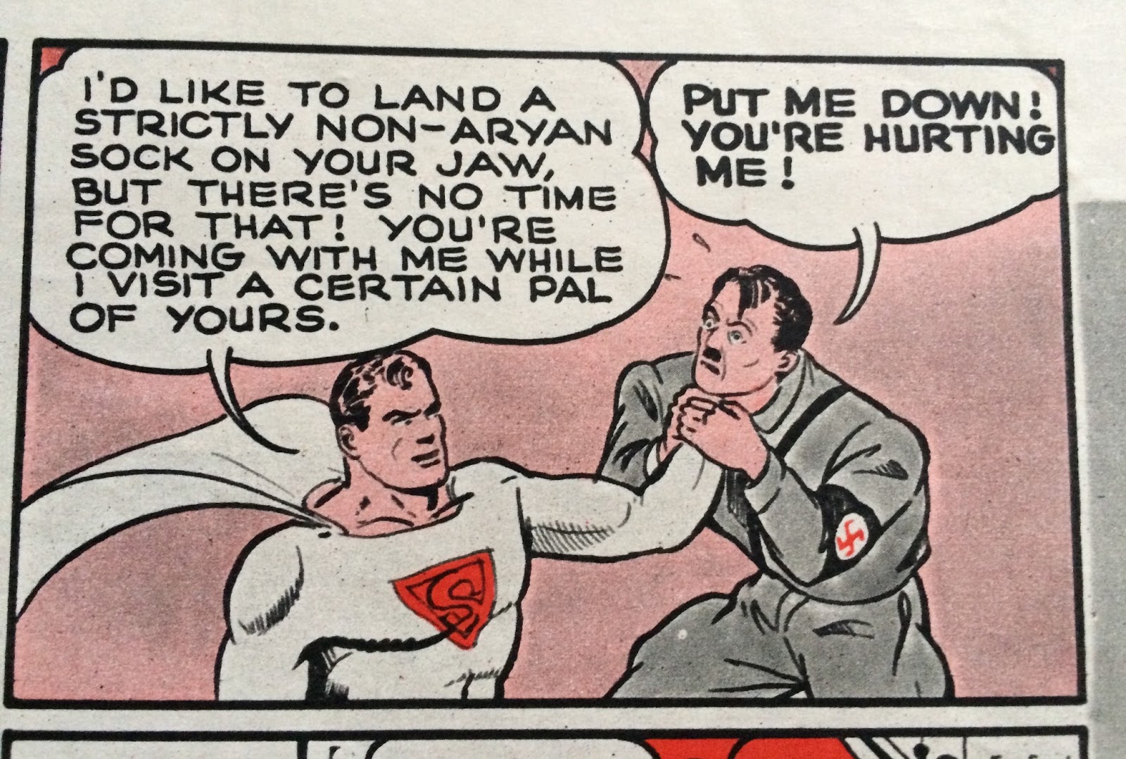
I liked the idea of Hitler’s fear of Superman, and indeed in real life, the Nazi propagandist Goebbels was afraid of the American concept of Superman. He railed against Superman’s “Jewishness”, due to his Jewish creators, in speeches to the German people and in the press. I designed the artwork to feature Superman front and center lifting up a begging Adolf Hitler and bumping his head right into the #1000. In his other hand he holds a tattered Nazi flag dragging in defeat on the ground.
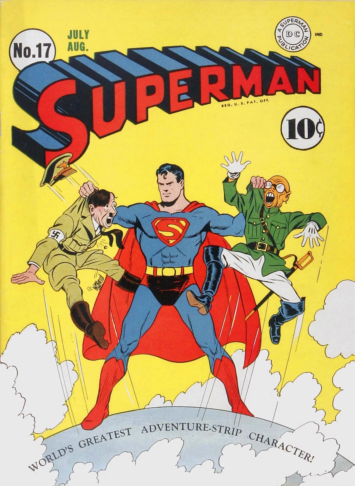
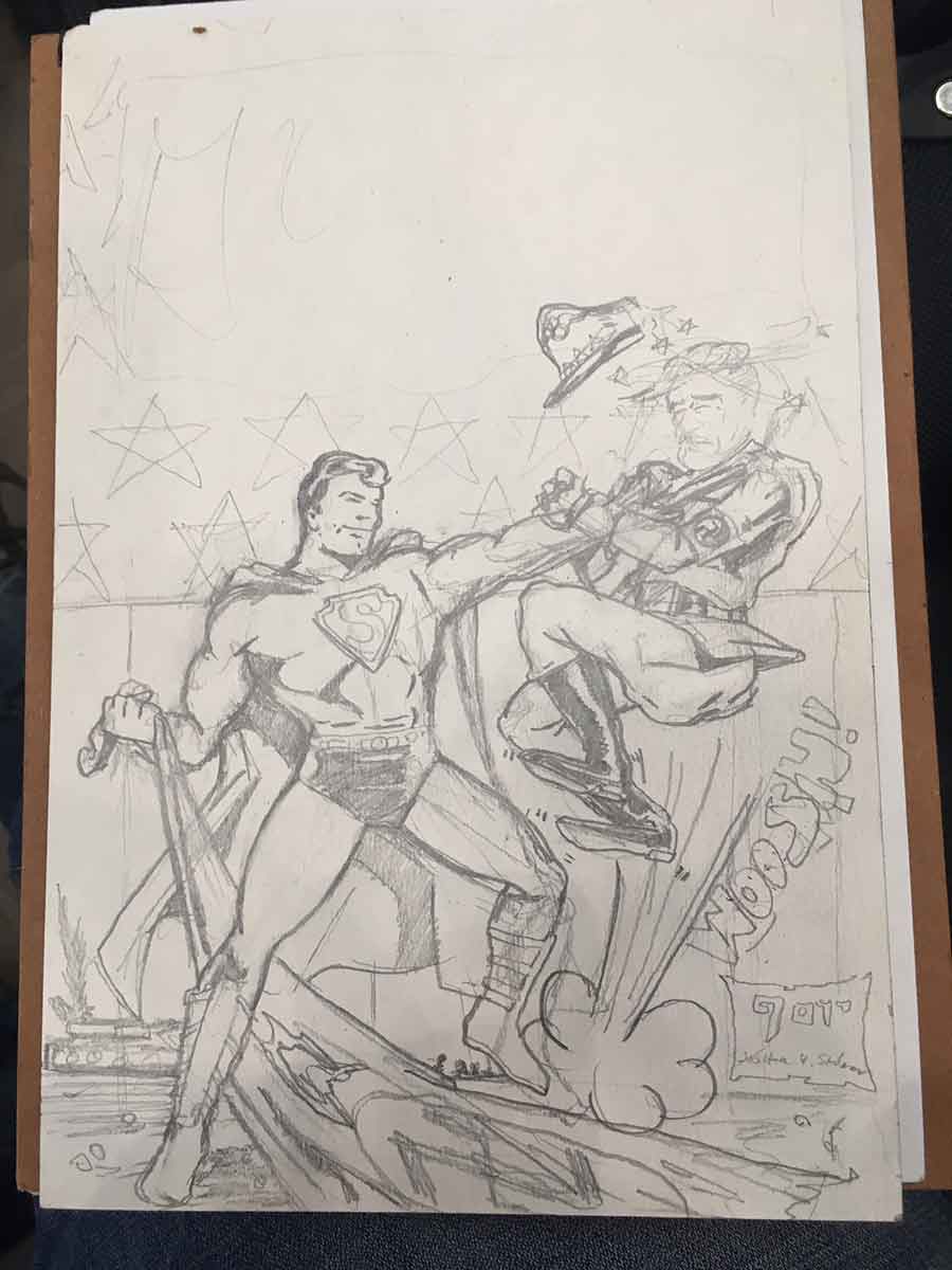
Here is my original preliminary sketch alongside some style references from the 1940’s. I wanted to capture that original simplified design style that defines the classic look. Superman appears barrel-chested and squinting eyes. The shading is organized with flat shapes. There are also some fun cartoon elements and sound affects that are typical of Golden Age comic art.
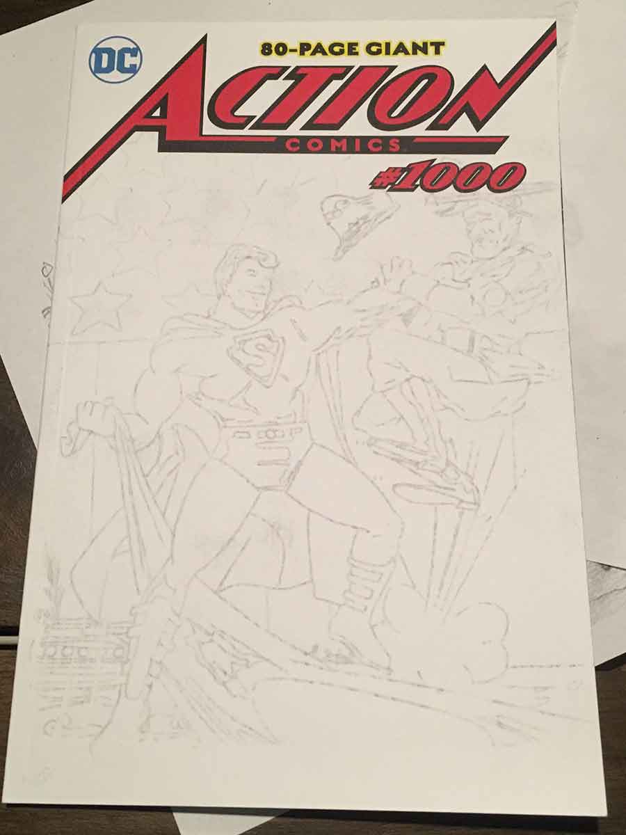
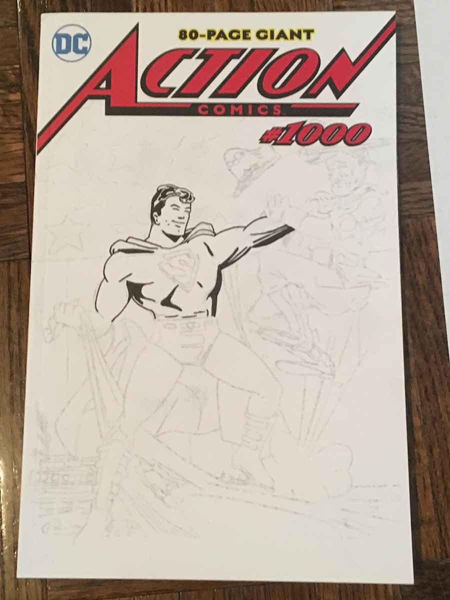
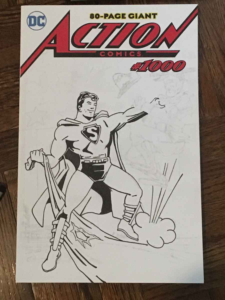
In the first stage, you can see that image has been transferred in light pencil to the actual cover. Most of the drawing will be refined during the inking process. In the second image, you can see how the black ink begins to add life to the illustration. Inking a piece of artwork isn’t just about following a line, but adding depth and varying thickness to fully realize the figure. You can see the difference in line quality by looking at the bold shapes on the right of his chest as to the left side.
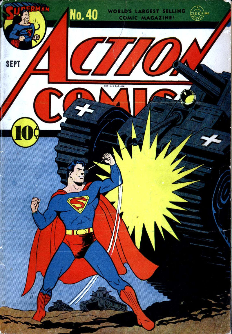
This is another great Superman cover by iconic designer, Fred Ray, that served as inspiration for my sketch cover. You will notice here that the Superman figure is now fully illustrated. His costuming is a mix of his earliest concept depictions (with Gladiator style boots) as well as the darkened “S” symbol of the 1940’s Max Fleischer cartoons.
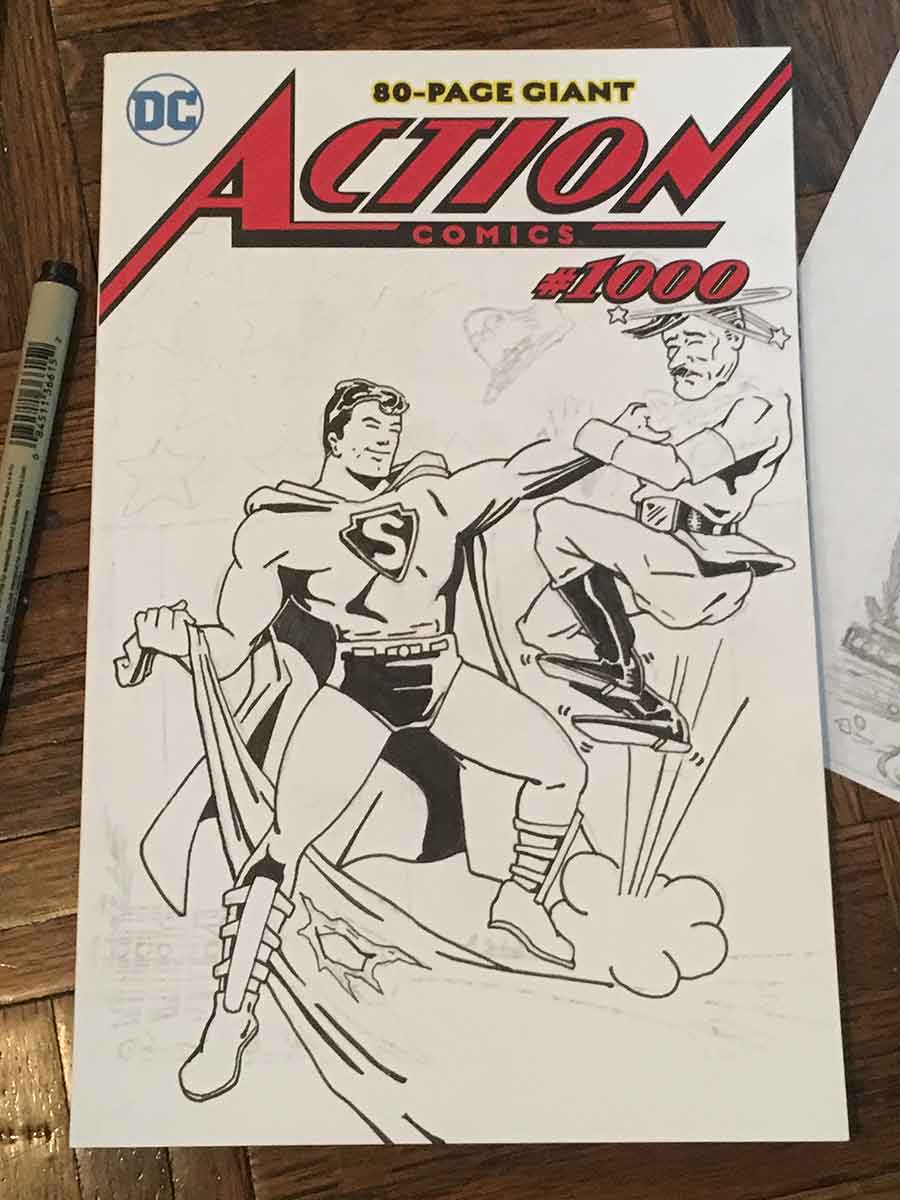
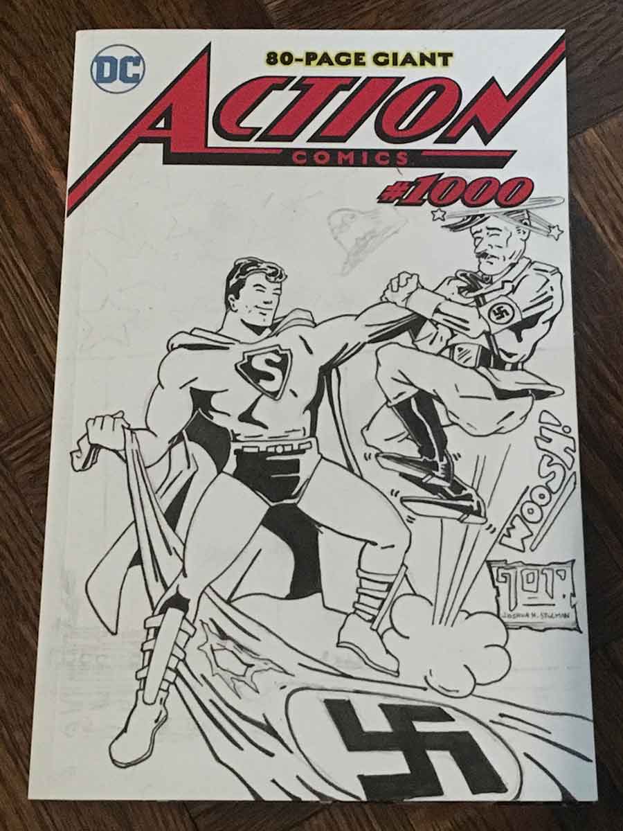
Now onto Hitler’s depiction. A mix of cartoon elements, I also want it to be clear that we’re mocking Adolf Hitler, so the face has to capture at least a passing resemblance. On the right, I’ve finished the Hitler figure and filled in the flag. The signature and sound affect are in place. Onto the background elements!
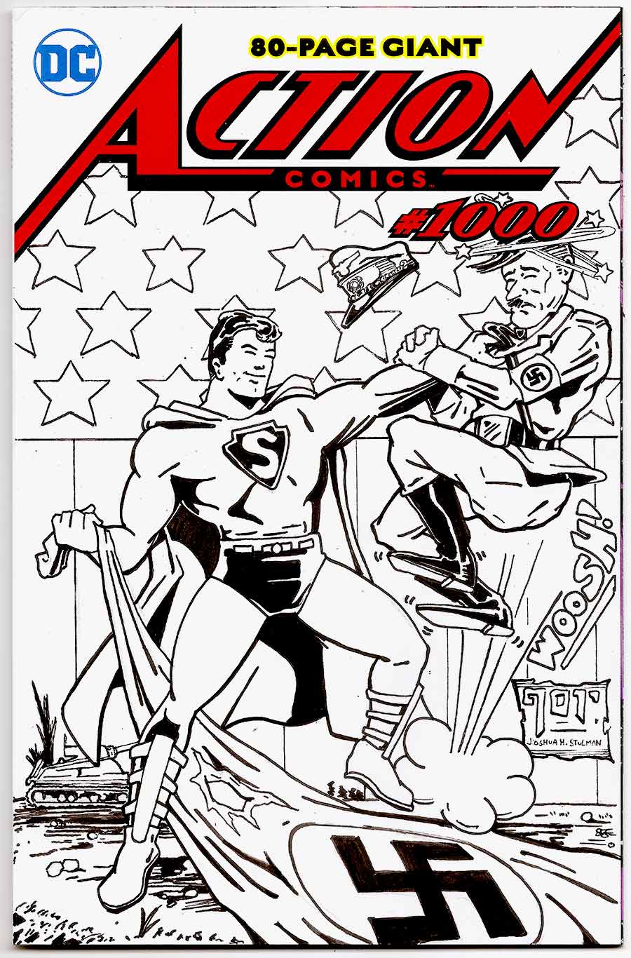
A simple background was all that was needed to complete the image. Some dark patches of grass and a tank in the background help establish the scene. The “Stars and Stripes” from my original sketch cover design return and really give the illustration that classic look.
If you enjoyed my artwork and would like to commission an original sketch cover, email me for details at info@brooklyncomicshop.com
or Check Out some of my Original Art Marvel & DC Sketch Covers: CLICK HERE
Each piece of artwork is Original and comes with a Certificate Of Authenticity COA.
Joshua H. Stulman
Owner, BrooklynComicShop.com
by Joshua H. Stulman In celebration of Independence Day, we are taking a look at our Top 10 Patriotic Comic Book Covers! Comic Book Covers…
by Joshua H. Stulman After 14 months under Covid19 Restrictions, we are finally emerging healthier and ready to resume normal life. To celebrate, we’re taking…
By Joshua H. Stulman Both DC Comics and Marvel have had a disturbing and shady history of maligning and excluding writers and artists from a…
by Joshua H. Stulman WandaVision, an 9 part TV series on Disney Plus, concludes today (March 5, 2021). The series has been a whirlwind mystery…
By Joshua H. Stulman What a great surprise when Ray Bradbury lifted up a copy of Shaloman and said “take a picture of this!” It…
© 2020 Brooklyn Comic Shop All Rights Reserved


Leave a reply