Artist Spotlight, Character Spotlight, History Of Comics
10 GREATEST SPIDER-MAN COVERS OF THE 1970’S
by Joshua H. Stulman
Spider-Man grew up in the 1970’s. Along with its readership, the life of Peter Parker matured in the 1970’s as well. The adventures of Spider-Man became deadlier in the 70’s that mirrored the real-life increase in crime in New York as well as the emergence of the “Anti-Hero” motif in American Pop Culture.
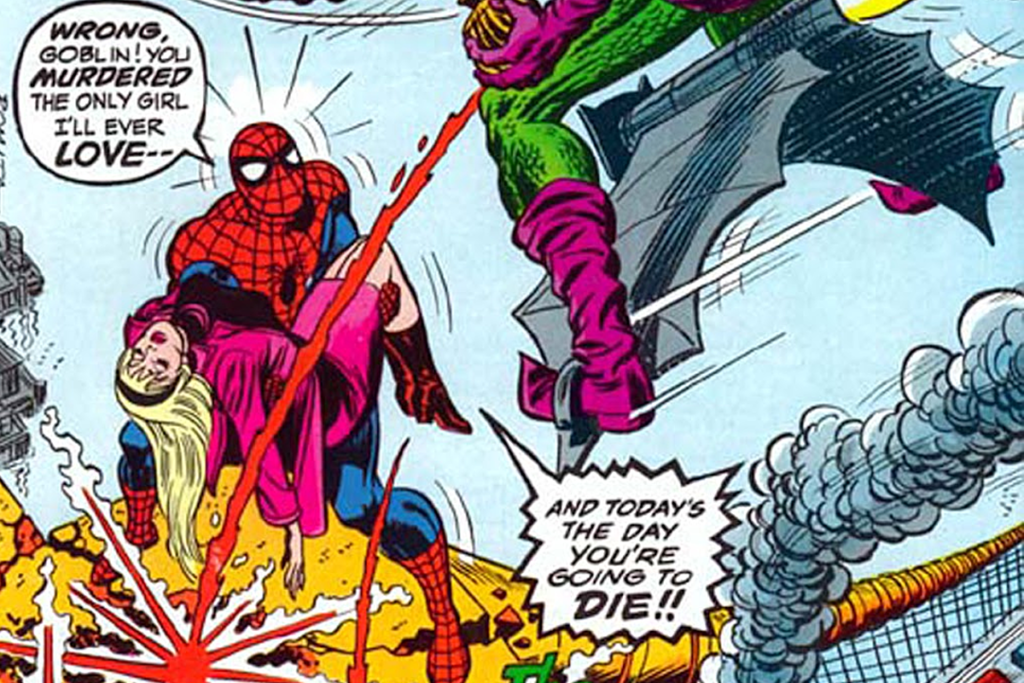
In publishing history, Marvel Comics expanded the Spider-Man brand into multiple monthly series including the Spectacular Spider-Man, Marvel Team-Up as well as featuring Spider-Man heavily in their Marvel Treasury Editions. Spider-Man also had a reprint series called Marvel Tales as well as a young readers series called Spidey’s Super Stories and a syndicated newspaper comic strip written by Stan Lee. There even was a UK Weekly Spider-Man reprint series that featured original artwork covers.
We’ve already done a Top 10 Silver Age Spider-Man Covers. Below are 10 of the Greatest Spider-Man Covers from the 1970’s. They were picked based completely on their artistic quality, composition, and pure excitement. This is NOT a “most valuable” list! So yes, its fairly subjective but we hope you enjoy!
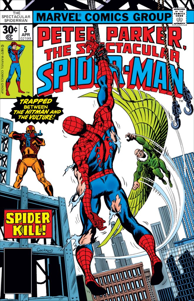
10. Spectacular Spider-Man # 5 (April, 1977)
This Spectacular Spider-Man cover by Dave Cockrum is a great example of his use of open space as a design element. Cockrum emerged in the mid-1970’s as part of Marvel’s new group of artistic talent. Overseen by John Romita as Marvel’s Art Director, Cockrum quickly rose through the ranks of Marvel through his ground breaking work on The All-New X-Men team featuring Wolverine and the next generation of mutants.
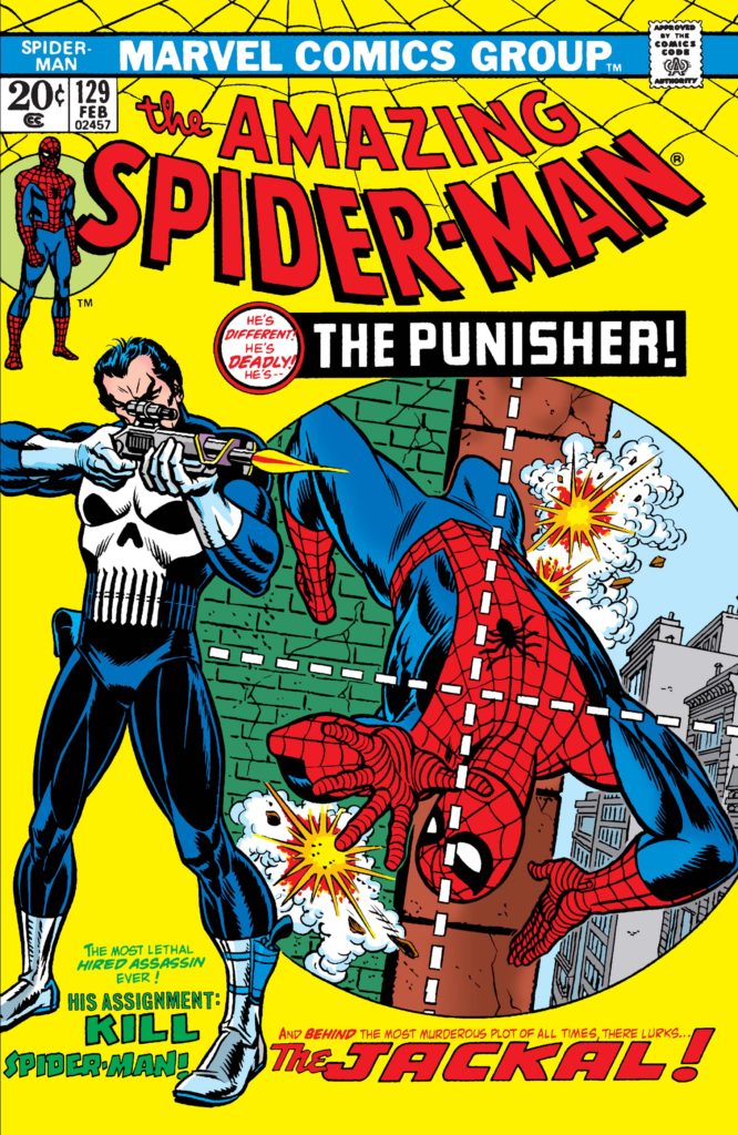
Marvel’s new artists brought a sense of both detail and realism to their artwork. Here, you can feel the helplessness of Spider-Man as he dangles, torn and beaten, from a single line of rope. (Note the Hitman is posed the same as Gil Kane’s Punisher from ASM # 129)
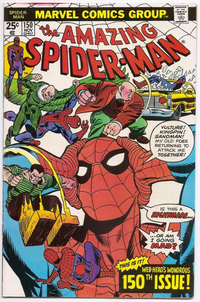
9. Amazing Spider-Man # 150 (Nov. 1975)
Is Spider-Man surrounded by his enemies or being driven insane? This great composition by Gil Kane that shows multiple scenes surrounding a central image of Spider-Man trying to steady his head. The scenes are perfectly balanced by three word bubbles. Although story-concept is similar to another great work by Co-creator Steve Ditko’s Amazing Spider-Man # 24, Gil Kanes design sense works well to create a clean and clear image that is still visually enticing.
Amazing Spider-Man # 150 is smack in the middle of the iconic Spider-Clone Saga that saw Peter Parker replaced by a genetic clone.
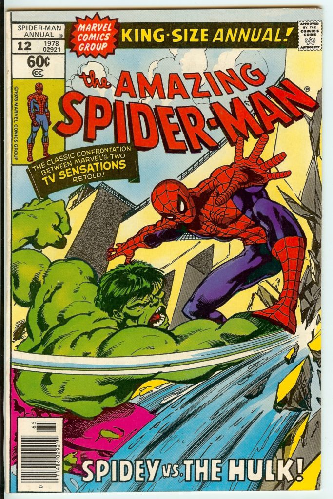
8. Amazing Spider-Man Annual # 12 (1978)
That’s one powerful punch being laid out by the Hulk courtesy of John Byrne! Byrne was one of Marvel’s best of new crop of 1970’s artists. He was fast and consistent and seemed to dominate Marvel towards the end of the 1970’s. He would leave his mark on Spider-Man several times over his nearly 25 year career with Marvel. Byrne, of course, is best known for his work on X-Men with Chris Claremont but has had great success across the Marvel Universe. His artwork was heavily influenced by Neal Adams, and has a perfect balance of realism and design.
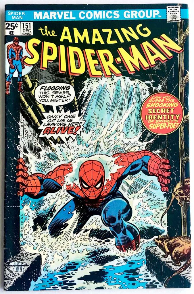
7. Amazing Spider-Man # 151 (December, 1975)
This Gil Kane/John Romita cover pays homage to Amazing Spider-Man #33 by Steve Ditko. Although, Ditko‘s version is much more dramatic by showing Spider-Man trapped under wreckage, Kane’s version is much more exciting with water pouring all around Spider-Man nearly bringing him to his knees.
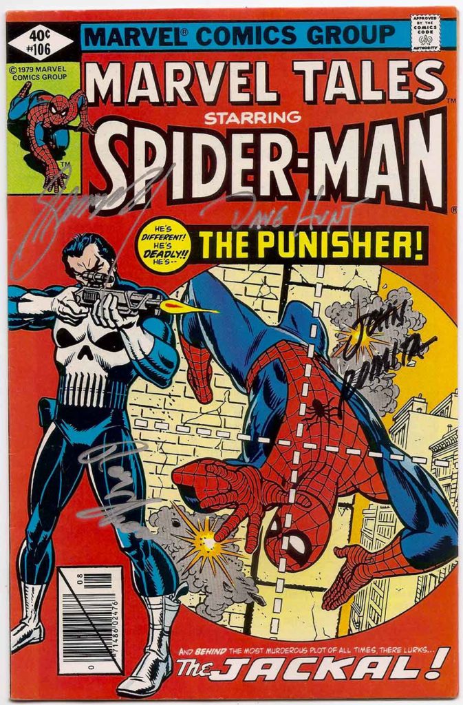
8. Amazing Spider-Man # 129 / Marvel Tales #106 (Feb. 1974)
There’s a reason why Gil Kane and John Romita keep making the Spider-Man best covers lists! This cover features pencils by Kane and inks by Romita premiered their co-creation, The Punisher! Depicted as a villain, the Punisher stands in full figure against a solid color background as the viewer is treated to his point of view through the gun sight line. Here Spider-Man flails about trying to dodge the bullets that are increasingly zeroing in on him. Tensions are high, and we can see the Punisher is closing in on his kill shot.
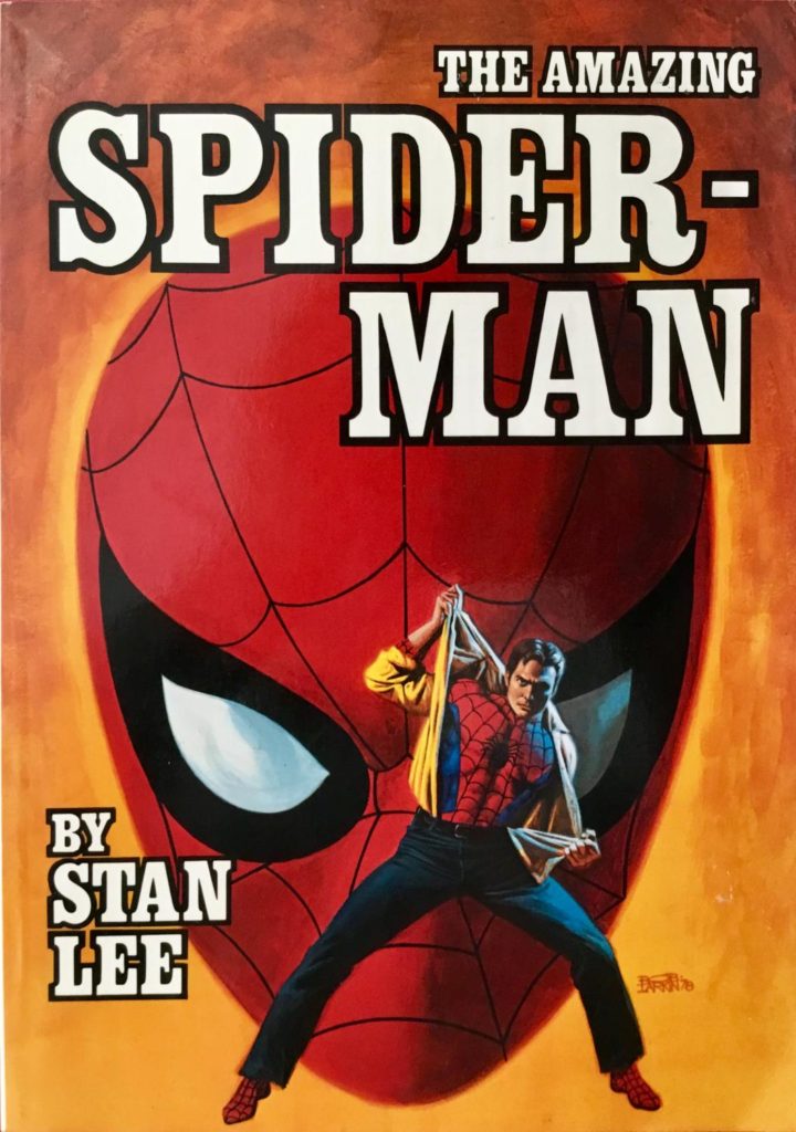
5. Amazing Spider-Man Trade Paperback (1979)
Painted illustrations in comics reach back to the proto-days of the Pulp Fiction era in the 1930’s. However by the 1970’s, a number of painters found work in the “uncensored” genre of comic magazines. The king of painted science fiction was Frank Frazetta, and his work was highly influencial in the field. Among these new painters were Earl Norem, Boris Vallejo and Bob Larkin. Larkin painted this fantastic and simplified image of Spider-Man getting ready to spring into action as the cover for Marvel’s expanding publishing foray into paperback books.
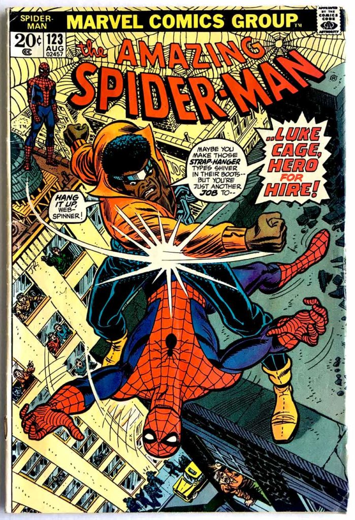
9. Amazing Spider-Man # 123 (August, 1973)
You can literally feel the power in the pummeling being handed to Spider-Man by Luke Cage courtesy of John Romita. Again the dramatic camera angle helps build a sense of tension, but also note all the many people reacting to the fight. From the expression on Harry Osborn’s face to everyone in the windows of the opposite building, as well as people on the street- everyone is worried for the web-slinger!
This is an early appearance of Luke Cage, and his featured front and center on the cover on purpose to introduce him to new readers (in the hopes of crossing over into his own book, Hero For Hire).
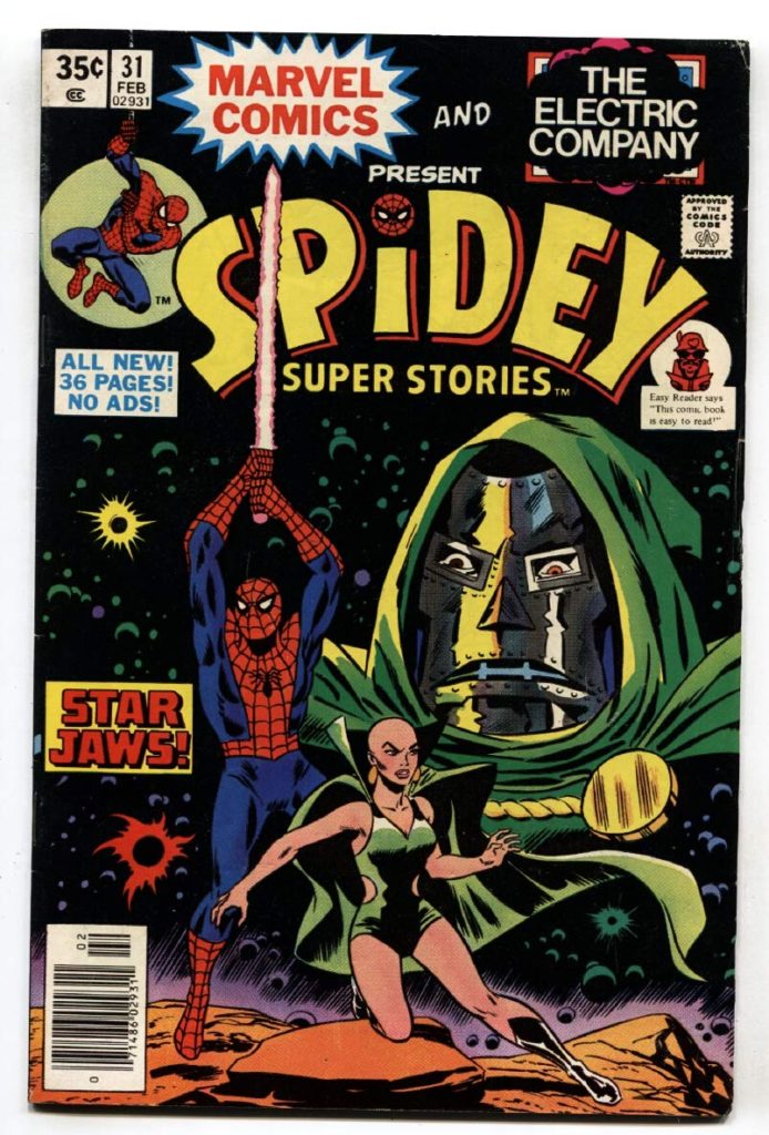
3. Spidey Super Stories # 31 (Feb. 1978)
This is a really fun one that is an homage piece to Dave Cockrum’s Star Wars Treasury Edition # 1 illustration. However, the treasury edition is also based on Greg and Tim Hildebrandt’s Star Wars movie poster painting. The artist for this comic was originally credited to Superman artist, Win Mortimer, who worked on much of the Spidey Super-Stories comics. It’s not clear whether it may be work by Keith Pollard (with some Jack Kirby influence). Either way, this cover shows Marvel’s reaching ability to tap into pop-culture.
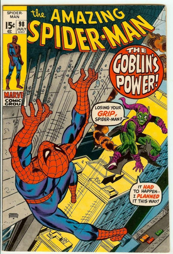
2. Amazing Spider-Man # 98 (July 1971)
A masterful cover by Gil Kane shows Spider-Man desperately trying to cling to a building while under attack by the Green Goblin. The cover is a perfect depiction of tension and suspense, with its dramatic angled composition. The body posing moves the viewers eyes in a circular pattern across all areas of the cover.
During the 1970’s, the Green Goblin played a pivotal part in changing Spider-Man’s life both in costume and as Peter Parker. Amazing Spider-Man # 98 is part of the famous Anti-Drug story that was the first of its kind by Stan Lee to raise awareness for America’s emerging drug problem. The story saw the Green Goblin’s son, Harry Osborn, and best friend of Peter Parker suffer a pill addiction.
Shortly afterwards, Spider-Man suffered his greatest defeat that saw the death his girlfriend (and soon to be fiance) Gwen Stacy at the hands of the original Green Goblin. In turn the Green Goblin died during this final battle with Spider-Man, only to have his persona adopted by Harry Osborn as Green Goblin II.
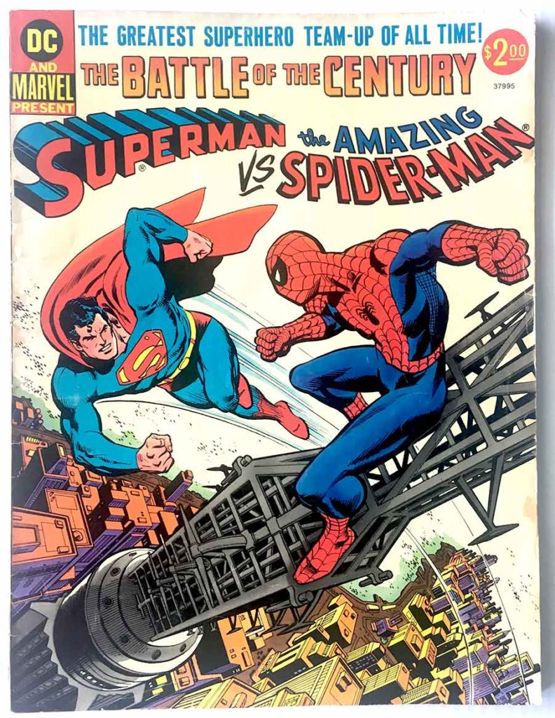
1. Battle of the Century: Superman Vs. The Amazing Spider-man (1975)
Possibly the greatest comic book of all time! This was the first cross-company super-hero story ever and everyone was all in. The deal was negotiated by Stan Lee at Marvel and Carmine Infantino at DC. All the super-stars of the industry were involved from Gerry Conway (Writer) and Ross Andru (Artist) to added artwork by Neal Adams and John Romita. Background assists were uncredited by Joe Rubinstein and Bob Wiacek as well as writing support by Roy Thomas, Marv Wolfman, and E. Nelson Bridewell.
The cover artwork went through several drafts trying to find the perfect balance of the two heroes, so that each could clearly be seen as not overshadowing the other but still retaining a sense of excitement. The artwork has a perfect sense of balance and a masterful use of the city-scape. The cover was laid out by Carmine Infantino and illustrated by Ross Andru. Neal Adams also drew Superman’s head to make sure it was “on model.”
Let us know in the comment section: What are your favorite Spidey Covers from the 1970’s?
CHECK OUT OUR SELECTION OF SPIDER-MAN COMICS
Joshua H. Stulman
Owner, Brooklyn Comic Shop




Leave a reply